Truly Indian
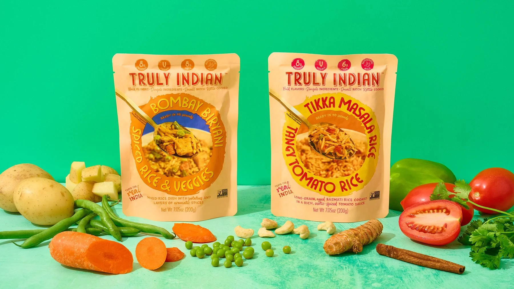
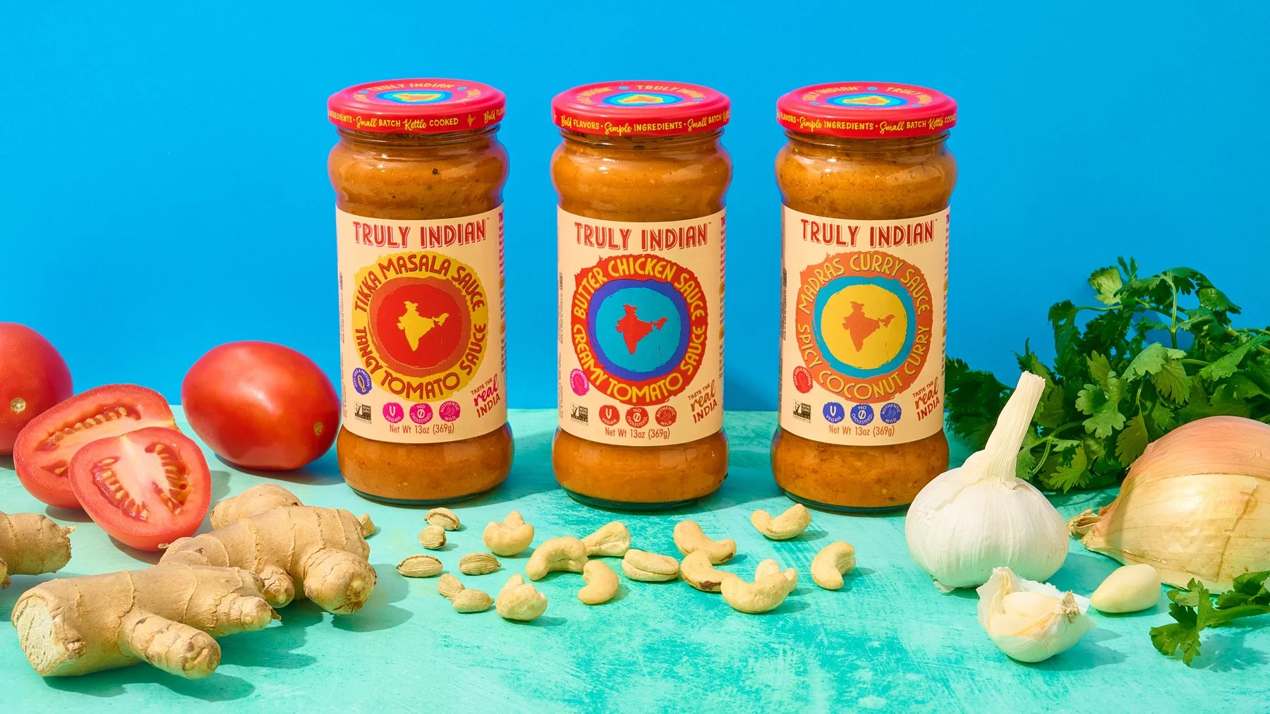
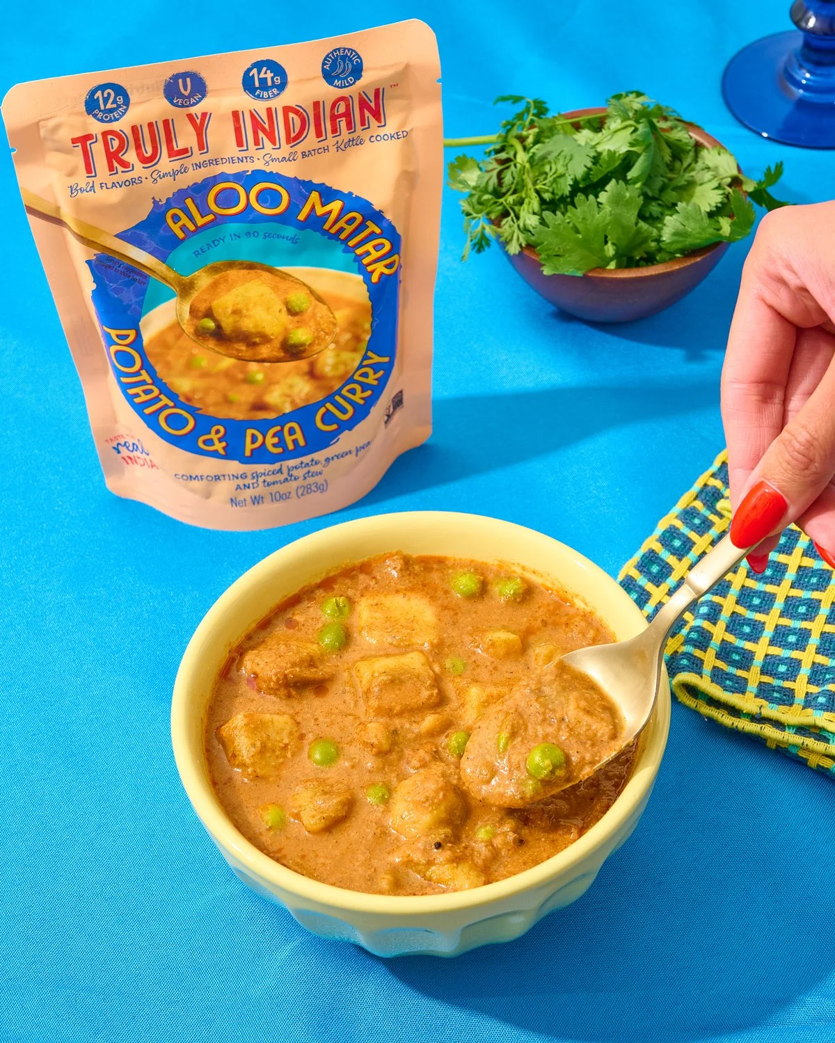
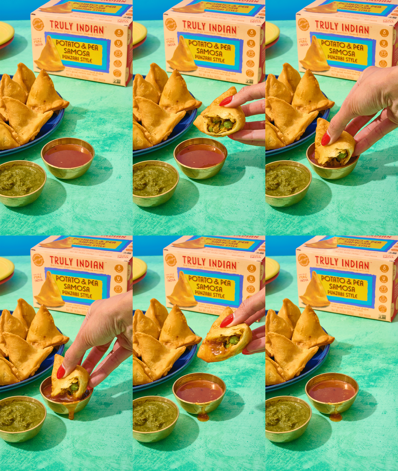
From packaging to launch: photography for 17+ Truly Indian SKUs across four product lines, followed by an ongoing creative partnership.
(01) The Ask
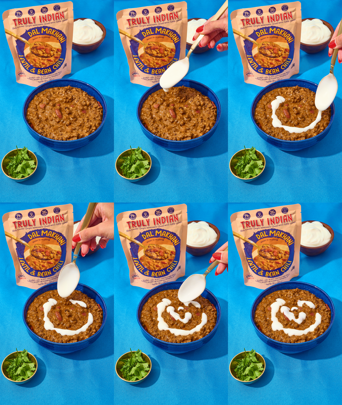
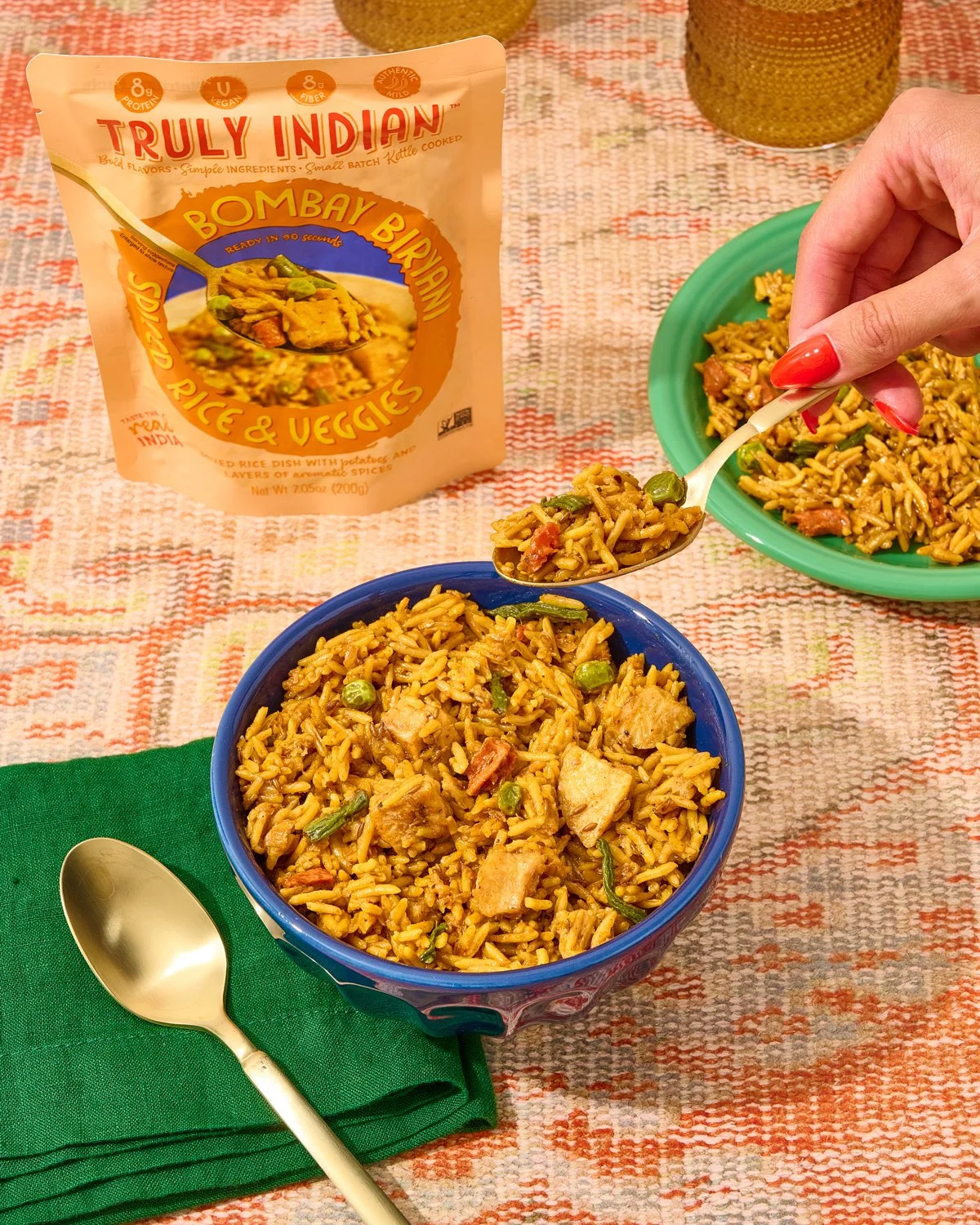
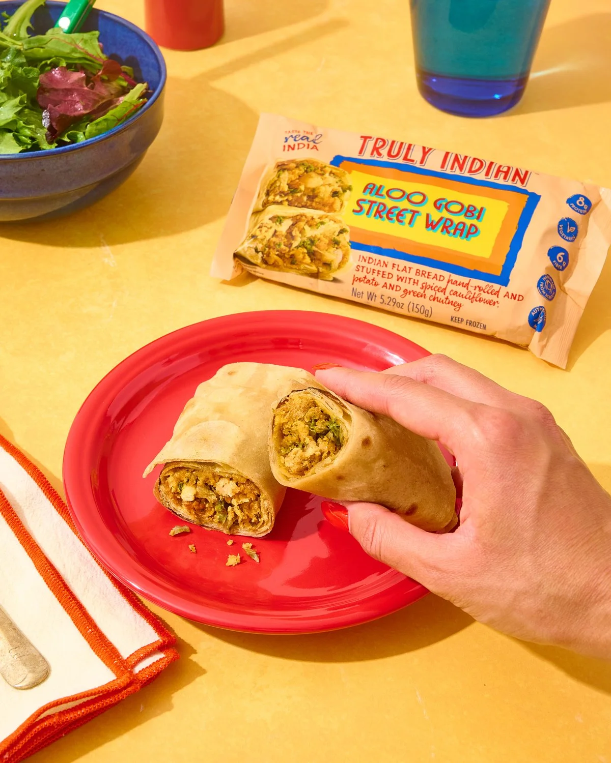
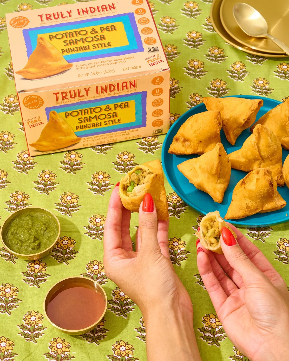
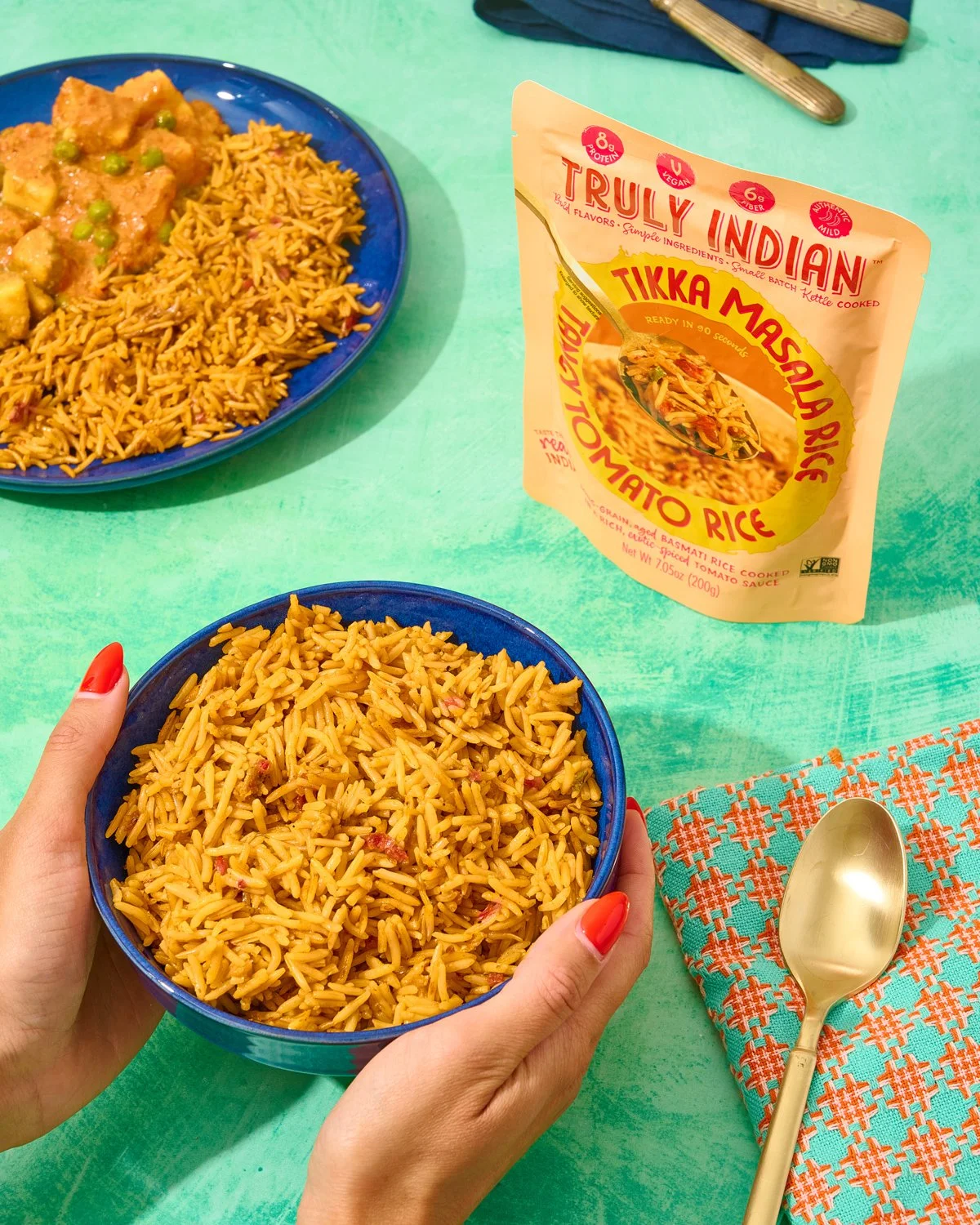
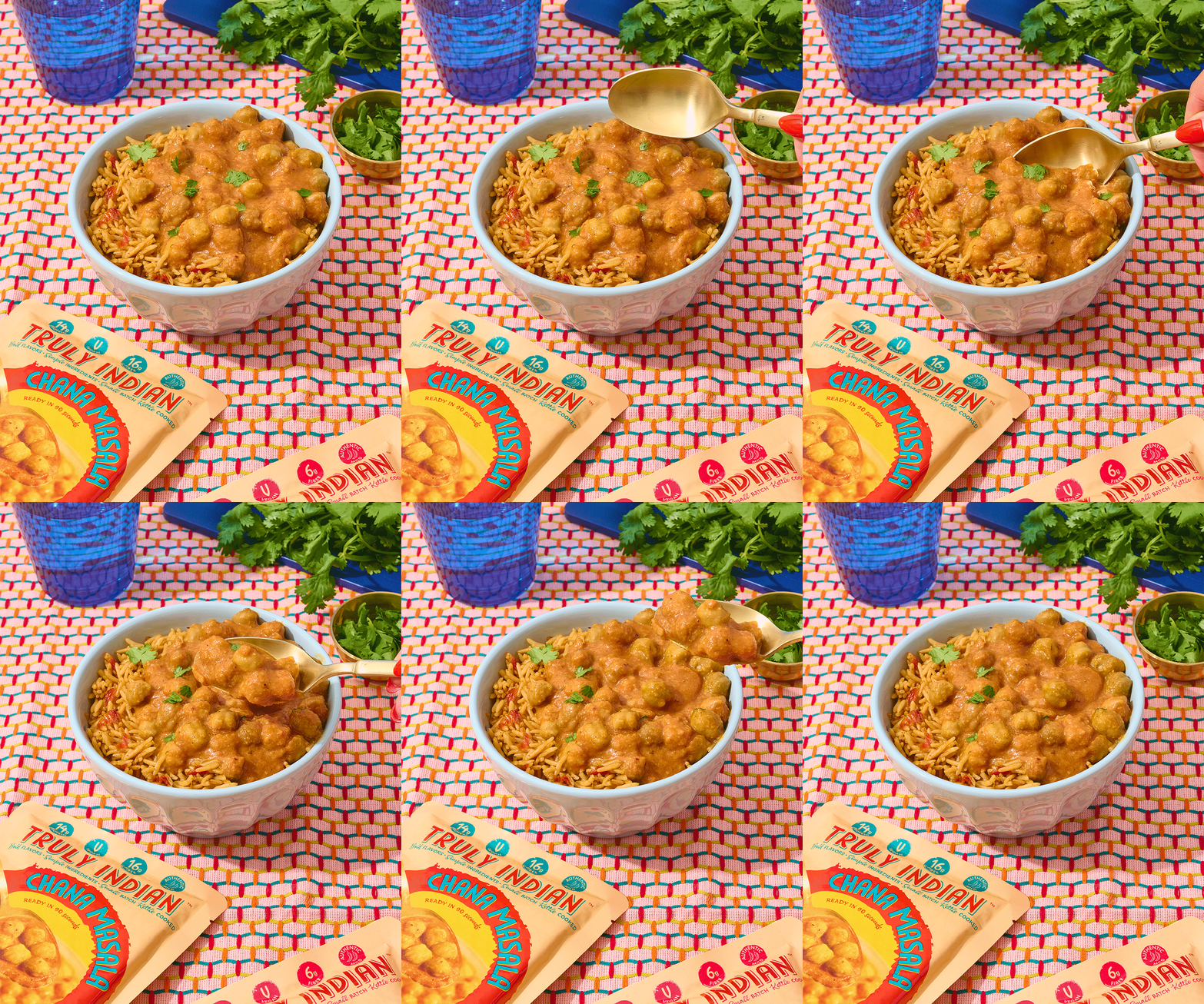
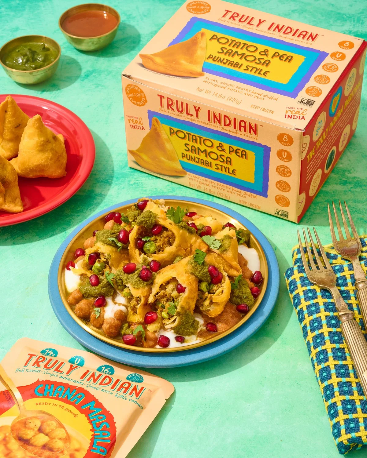
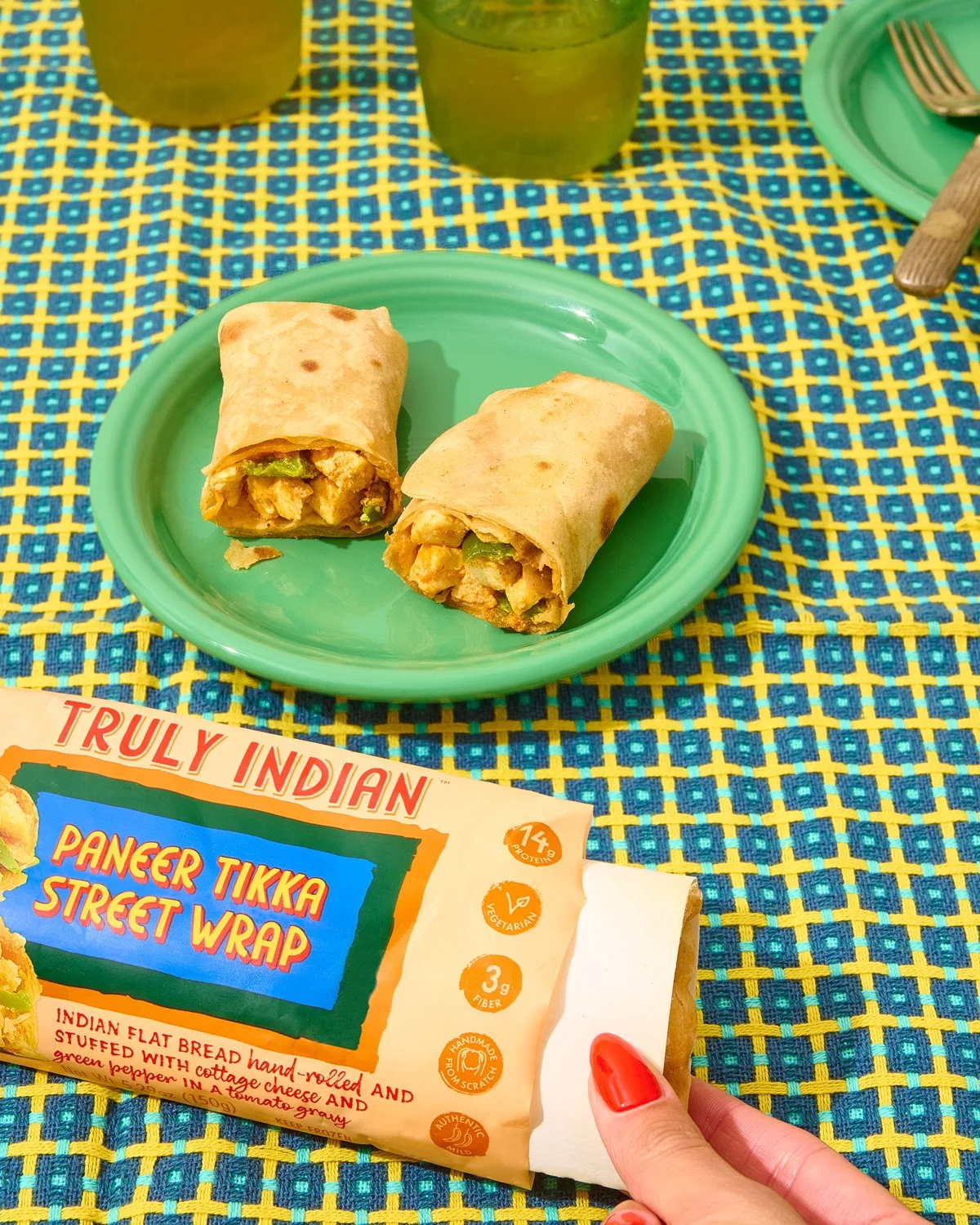
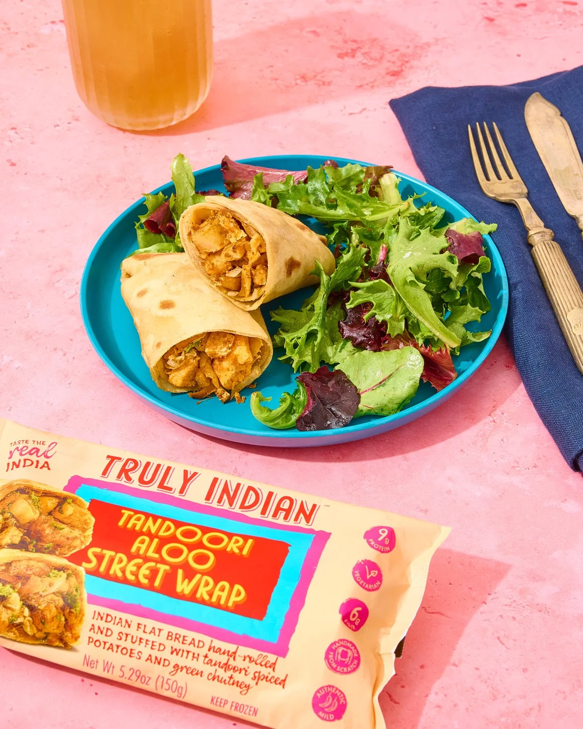
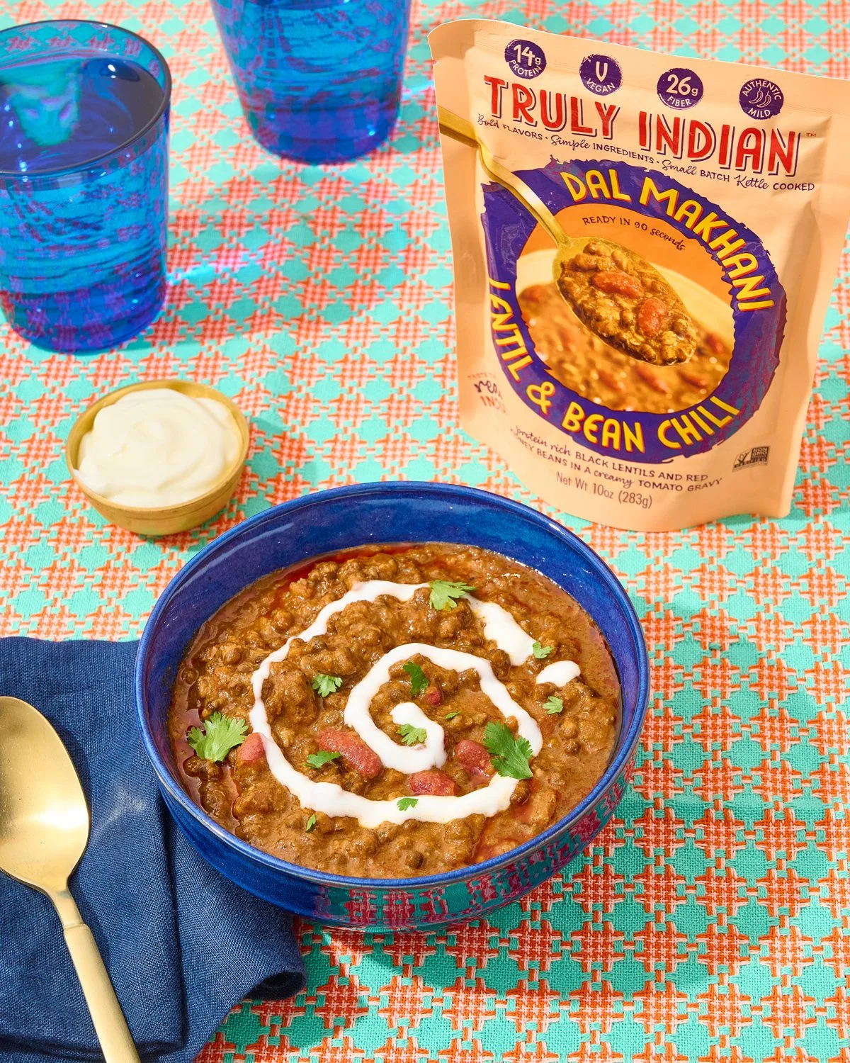
Truly Indian needed food photography for its redesigned packaging across naans, wraps, rices, and ready-to-eat meals, with branding and packaging design by Andrew C Bly. The imagery needed to bring traditional Indian flavors into a modern visual world, then carry that direction into launch content featuring the finished packs.
(02) The Solution
We created the food photography that went on the packaging, then photographed the finished products for the rebrand launch. Jewel tones, saturated colors, warm golds and bronzes, Indian fabrics, and woods brought richness to the scenes, balanced with styling that felt thoughtfully arranged but still lived in. The partnership has continued through new SKU launches, holidays, and evergreen content, with the work earning a Gold Hermes Creative Award.
Rich colors, bold flavors, and a little gold. From the packaging to the plate.